Choice is a good thing, right? Well, the more choices a website or web application offers, the harder it is to understand the interface. Studies show that having too many options often leads to decision paralysis and frustration. As a general rule, people only value an abundance of features before they actually start using the given product. After they have started using it, the simpler solution wins with higher satisfaction.
Neuropsychologist Susan Weinschenk suggests to “Resist the impulse to provide lots and lots of choices to your customers. Remember they will SAY they want lots of choices, and you will think that lots of choices is a good thing (because you like them too), but too many choices means they won’t buy at all.” You Want More Choices and Information Than You Can Actually Process.
Hick’s law states that the time it takes to make a decision increases with the number and complexity of choices. And as the decision time increases, the user experience suffers.
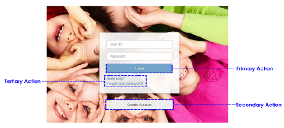
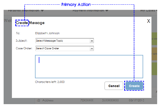
Examples - Several buttons under forms: Which is the primary or recommended action?
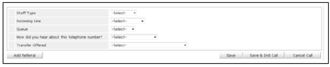
Problems with Multiple Buttons
- Command (buttons) that look the same can be hard for users to correctly and quickly choose between, thus slowing down task completion.
- Users need to know what actions to take on a screen/form to complete their task.
- A button, also known as a command button, gives the user a way to trigger an immediate action.
Solutions
- Match the visual presentation of actions to their importance to minimize the risk for potential errors and help people complete the task as quickly as possible.
- If there is an overall goal that a view is addressing, then the primary action will most likely be whatever enables users to accomplish that goal.
- Avoid secondary actions if possible.
- Ensure a clear visual distinction between primary and secondary actions.
- Buttons should always be labeled with the “verb” or the action of the statement.
Rationale
- Visual distinction between actions helps users make “good” choices.
- Having an obvious target action that makes sense for most people most of the time both reinforces a sense of the goal that people are working towards and makes it easy to take action to accomplish that goal.
- Especially when there are multiple possible commands within a given view, visually emphasizing the primary one can really help people quickly move on with accomplishing their goal and also can increase the likelihood that they will choose the right action for a given context, which could mean lower customer service costs and higher customer satisfaction.